
In the future whenever I use SPARQL to retrieve numeric data I'll have some much more interesting ideas about what I can do with that data.
In part 1 of this series, I discussed the history of R, the programming language and environment for statistical computing and graph generation, and why it's become so popular lately. The many libraries that people have contributed to it are a key reason for its popularity, and the SPARQL one inspired me to learn some R to try it out. Part 1 showed how to load this library, retrieve a SPARQL result set, and perform some basic statistical analysis of the numbers in the result set. After I published it, it was nice to see how its comments section filled up with a nice list of projects out there that combine R and SPARQL.
If you executed the sample commands from Part 1 and saved your session when quitting out of R (or in the case of what I was doing last week, RGui), all of the variables set in that session will be available for the commands described here. Today we'll look at a few more commands for analyzing the data, how to plot points and regression lines, and how to automate it all so that you can quickly perform the same analysis on different SPARQL result sets. Again, corrections welcome.
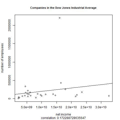
My original goal was to find out how closely the number of employees in the companies making up the Dow Jones Industrial Average correlated with the net income, which we can find out with R's cor() function:
> cor(queryResult$netIncome,queryResult$numEmployees)
[1] 0.1722887
A correlation figure close to 1 or -1 indicates a strong correlation (a negative correlation indicates that one variable's values tend to go in the opposite direction of the other's—for example, if incidence of a certain disease goes down as the use of a particular vaccine goes up) and 0 indicates no correlation. The correlation of 0.1722887 is much closer to 0 than it is to 1 or -1, so we see very little correlation here. (Once we automate this series of steps, we'll finder strong correlations when we focus on specific industries.)
More graphing
We're going to graph the relationship between the employee and net income figures, and then we'll tell R to draw a straight line that fits as closely as possible to the pattern created by the plotted values. This is called a linear regression model, and before we do that we tell R to calculate some data necessary for this task with the lm() ("linear model") function:
> myLinearModelData <- lm(queryResult$numEmployees~queryResult$netIncome)
Next, we draw the graph:
> plot(queryResult$netIncome,queryResult$numEmployees,xlab="net income",
   ylab="# of employees", main="Dow Jones Industrial Average companies")
As with the histogram that we saw in Part 1, R offers many ways to control the graph's appearance, and add-in libraries let you do even more. (Try a Google image search on "fancy R plots" to get a feel for the possibilities.) In the call to plot() I included three parameters to set a main title and labels for the X and Y axes, and we see these in the result:
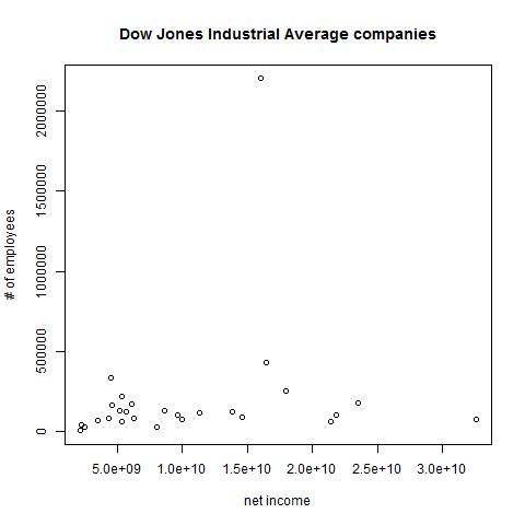
We can see more intuitively what the cor() function already told us: that there is minimal correlation between the rise of employee counts and net income in the companies comprising the Dow Jones Industrial average.
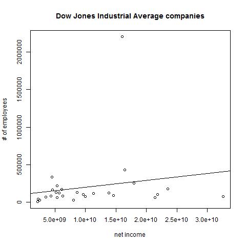
Let's put the data that we stored in myLinearModelData to use. The abline() function can use it to add a regression line to our plot:
> abline(myLinearModelData)
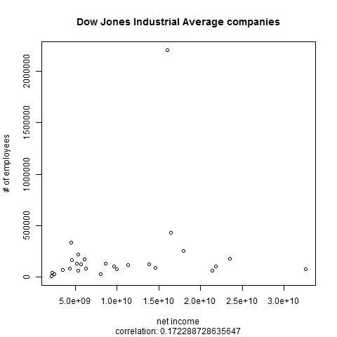
When you type in function calls such as sd(queryResult$numEmployees) and cor(queryResult$netIncome,queryResult$numEmployees), R prints the return values as output, but you can use the return values in other operations. In the following, I've replotted the graph with the cor() function call's result used in a subtitle for the graph, concatenated onto the string "correlation: " with R's paste() function:
 plot(queryResult$netIncome,queryResult$numEmployees,xlab="net income",
   ylab="# of employees", main="Dow Jones Industrial Average companies",
   sub=paste("correlation: ",cor(queryResult$numEmployees,
             queryResult$netIncome),sep=""))
(The paste() function's sep argument here shows that we don't want any separator between our concatenated pieces. I'm guessing that paste() is more typically used to create delimited data files.) R puts the subtitle at the image's bottom:
Instead of plotting the graph on the screen, we can tell R to send it to a JPEG, BMP, PNG, or TIFF file. Calling a graphics devices function such as jpeg() before doing the plot tells R to send the results to a file, and dev.off() turns off the "device" that writes to the image file.
Automating it
Now we know nearly enough commands to create a useful script. The remainder are just string manipulation functions that I found easy enough to look up when I needed them, although having a string concatenation command called paste() is another example of the odd R terminology that I warned about last week. Here is my script:
library(SPARQL)

category <- "Companies_in_the_Dow_Jones_Industrial_Average"
#category <- "Electronics_companies_of_the_United_States"
#category <- "Financial_services_companies_of_the_United_States"

query <- "PREFIX rdfs: <http://www.w3.org/2000/01/rdf-schema#>
PREFIX dcterms: <http://purl.org/dc/terms/>
PREFIX dbo: <http://dbpedia.org/ontology/>
PREFIX dbpprop: <http://dbpedia.org/property/>
PREFIX xsd: <http://www.w3.org/2001/XMLSchema#>
SELECT ?label ?numEmployees ?netIncome
WHERE {
  ?s dcterms:subject <http://dbpedia.org/resource/Category:DUMMY-CATEGORY-NAME> ;
     rdfs:label ?label ;
     dbo:netIncome ?netIncomeDollars ;
     dbpprop:numEmployees ?numEmployees .
     BIND(replace(?numEmployees,',','') AS ?employees)  # lose commas
     FILTER ( lang(?label) = 'en' )
     FILTER(contains(?netIncomeDollars,'E'))
     # Following because DBpedia types them as dbpedia:datatype/usDollar
     BIND(xsd:float(?netIncomeDollars) AS ?netIncome)
     # Original query on following line had two
     # slashes, but R needed both escaped.
     FILTER(!(regex(?numEmployees,'\\\\d+')))
}
ORDER BY ?numEmployees"

query <- sub(pattern="DUMMY-CATEGORY-NAME",replacement=category,x=query)

endpoint <- "http://dbpedia.org/sparql"
resultList <- SPARQL(endpoint,query)
queryResult <- resultList$results
correlationLegend=paste("correlation: ",cor(queryResult$numEmployees,
                         queryResult$netIncome),sep="")
myLinearModelData <- lm(queryResult$numEmployees~queryResult$netIncome)
plotTitle <- chartr(old="_",new=" ",x=category)
outputFilename <- paste("c:/temp/",category,".jpg",sep="")
jpeg(outputFilename)
plot(queryResult$netIncome,queryResult$numEmployees,xlab="net income",
     ylab="number of employees", main=plotTitle,cex.main=.9,
     sub=correlationLegend)
abline(myLinearModelData)
dev.off()
Instead of hardcoding the URI of the industry category whose data I wanted, my script has DUMMY-CATEGORY-NAME, a string that it substitutes with the category value assigned at the script's beginning. The category value here is "Companies_in_the_Dow_Jones_Industrial_Average", with the setting of two other potential category values commented out so that we can easily try them later. (R, like SPARQL, uses the # character for commenting.) I also used the category value to create the output filename.
An additional embellishment to the sequence of commands that we entered manually is that the script stores the plot title in a plotTitle variable, replacing the underscores in the category name with spaces. Because this sometimes resulted in titles that were too wide for the plot image, I added cex.main=9 as a plot() argument to reduce the title's size.
With the script stored in /temp/myscript.R, entering the following at the R prompt runs it:
source("/temp/myscript.R")
If I don't have an R interpreter up and running, I can run the script from the operating system command line by calling rscript, which is included with R:
rscript /temp/myscript.R
After it runs, my /temp directory has this Companies_in_the_Dow_Jones_Industrial_Average.jpg file in it:
When I uncomment the script's second category assignment line instead of the first and run the script again, it creates the file Electronics_companies_of_the_United_States.jpg:
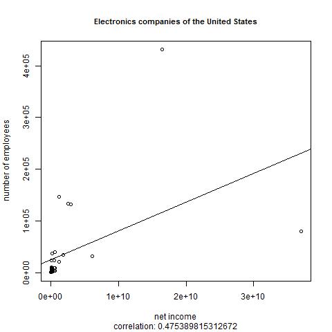
There's better correlation this time, of almost .5. Fitting two particular outliers onto the plot means that R put enough points in the lower-left to make a bit of a blotch; I did find with experimentation that the plot() command offers parameters to only display the points within a particular range of values on the horizontal or vertical axis, making it easier to show a zoomed view.
Here's what we get when querying about Financial_services_companies_of_the_United_States:
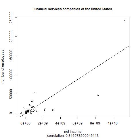
We see the strongest correlation yet: over .84. I suppose that at financial services companies, hiring more people is more likely to increase revenue than in other typical sectors because you can provide (and charge for) a higher volume of services. This is only a theory, but that's why people use statistical analysis packages: to look for patterns that can suggest theories, and it's great to know that such a powerful open-source package can do this with data retrieved from SPARQL endpoints.
If I was going to run this script from the operating system command line regularly, then instead of setting the category value at the beginning of the script, I would pass it to rscript as an argument with the script name.
Learning more about R
Because of R's age and academic roots, there is a lot of stray documentation around, often in LaTeXish-looking PDFs from several years ago. Many introductions to R are aimed at people in a specific field, and I suppose my blog entries here fall in this category.
The best short, modern tour of R that I've found recently is Sharon Machlis's six-part series beginning at Beginner's Guide to R: Introduction. Part six points to many other places to learn about R ranging from blog entries to complete books to videos, and reviewing the list now I see more entries that I hadn't noticed before that look worth investigating.
Her list is where I learned about Jeffrey M. Stanton's Introduction to Data Science, an excellent introduction to both Data Science and to the use of R to execute common data science analysis tasks. The link here goes to an iTunes version of the book, but there's also a PDF version, which I read beginning to end.
The R Programming Wikibook makes a good quick reference work, especially when you need a particular function for something; see the table of contents down its right side. I found myself going back to the Text Processing page there several times. The four-page "R Reference Card" (pdf) by Tom Short is also worth printing out.
Last week I mentioned John D. Cook's R language for programmers, a blog entry that will help anyone familiar with typical modern programming languages get over a few initial small humps more quickly when learning R.
I described Machlis's six-part series as "short" because there there are so many full-length books on R out there, such as free ones like Stanton's and several offerings from O'Reilly and Manning. I've read the first few chapters of Manning's R in Action by Robert Kabakoff and find it very helpful so far. Apparently a new edition is coming out in March, so if you're thinking of buying it you may want to wait or else get the early access edition. Manning's Practical Data Science with R also looks good, but assumes a bit of R background (in fact, it recommends "R in Action" as a starting point), and a real beginner to this area would be better off starting with Stanton's free book mentioned above.
O'Reilly has several books on R, including an R Cookbook whose very task-oriented table of contents is worth skimming, as well as an accompanying R Graphics Cookbook.
I know that I'll be going back to several of these books and web pages, because in the future whenever I use SPARQL to retrieve numeric data I'll have some much more interesting ideas about what I can do with that data.
Please add any comments to this Google+ post.